


Time
3 Week
Team
2 UX Designers
Role
User Research
UX/UI Designer
Deliverables
Figma Prototype
Poster
Visual Design
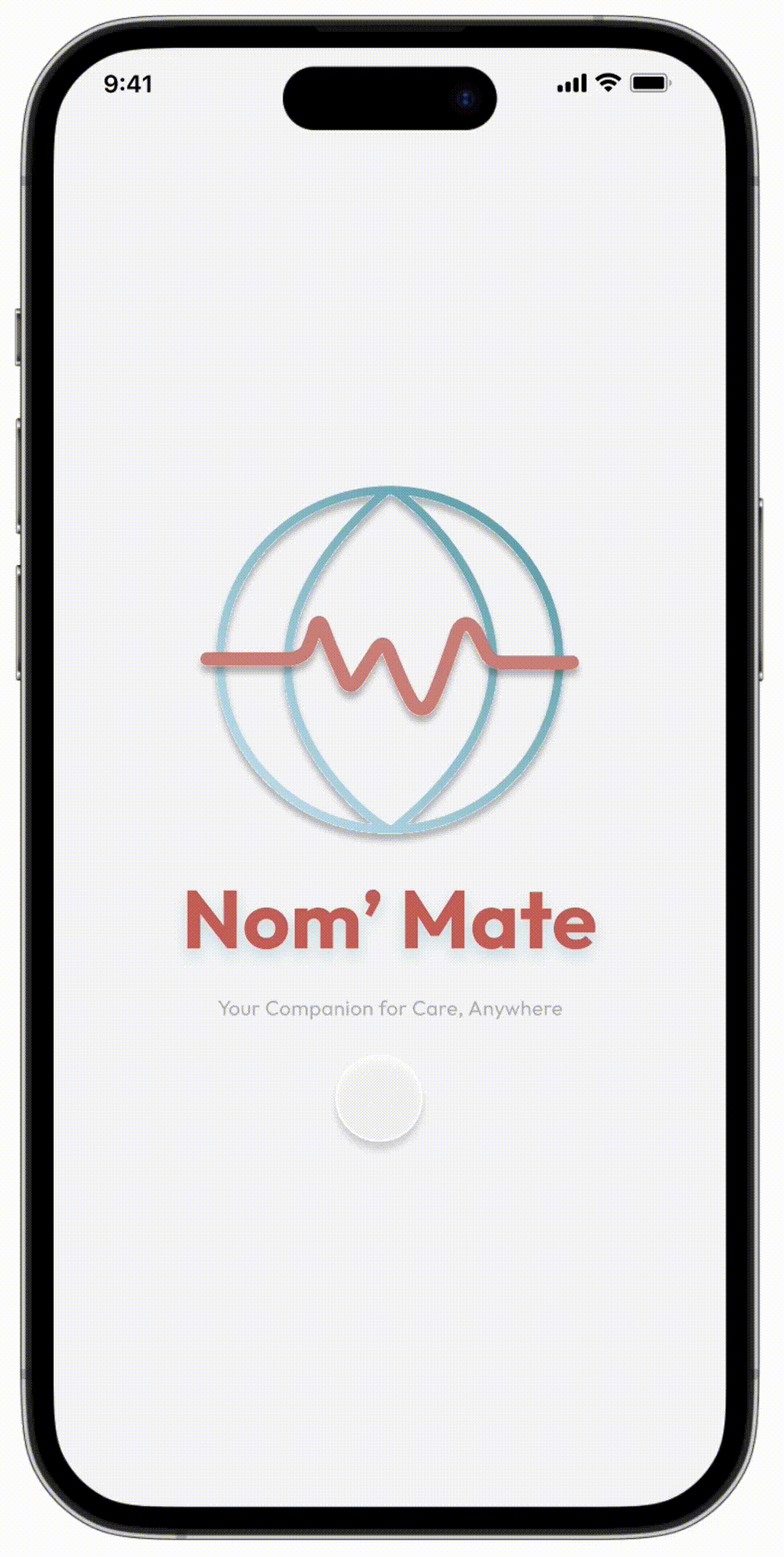
We designed Nom’ Mate - an App for digital nomads to access medical services and stay safe in an unfamiliar area.
This was the final project of COSC 125 UI/UX Design course at Dartmouth College. we are two in a team, collaborated in the design process, conducting user research, brainstorming ideas, prototyping, testing and polishing the designs.
BACKGROUND
Digital nomads generally combine remote work and travel, passionate about traveling and new adventures, they know how to make the most of new technologies and only need an internet connection to work from anywhere in the world.
2nd leading factor in choosing a location for digital nomads worldwide in 2022 is Safety.
Statista
10 million more than in 2019. The number of digital nomads in the United States continuously increased over the last three years and reached 17.3 million as of mid-2023
Statista
PROBLEM
Despite their strong adaptability to frequently changing work and living environments, digital nomads face unique challenges, particularly ones related to healthcare.
When arriving in unfamiliar places, language barriers can make it difficult for them to accurately describe their symptoms and medical history to healthcare providers.
Additionally, a lack of familiarity with the local healthcare system and emergency numbers, especially in urgent medical situations, can pose significant risks to their safety and health.
OPPORTUNITY
How might we design a solution that quickly connects digital nomads to medical services in medical emergencies, ensuring a safer experience in unfamiliar areas?
SOLUTION
Nom' Mate
Telehealth
Community Hub
Symptom Check
Emergent Contact List
......

PROCESS
Empathize
Define
Define
Ideate
Prototype
Test
Reflect
Background Research
User Interview
Empathy Map
Persona
User Journeys
POV Statement
Industry Research
Design Concept
HMW Questions
Brainstorming
Crazy 8 Sketches
Solution Sketches
Greyscales
Usability Test
Low Fidelity Prototype
User Test (greyscales)
UI Design
High Fidelity Prototype
Takeaways & Improvements
EMPATHIZE
Background
Given the prompt of lending a hand for our final project, we employed qualitative research techniques to deeply comprehend and empathize with individuals who have faced or are facing crises, as well as those eager to aid others in such situations.
Our approach included conducting initial user interviews to gain insights into their crisis experiences. We focused on understanding their immediate resource needs during a crisis, daily challenges, emotional struggles, and the coping strategies they employ, all with the goal of crafting user-centered solutions.
In the pursuit of refining our project, we meticulously revisited and analyzed the data from our initial user interviews. Through this analysis, we identified two universally mentioned user needs: access to medical resources and the need for live information updates. This insight led us to conduct a comprehensive secondary research to explore these needs further and brainstorm potential user personas who might have these requirements.
During our secondary research, we uncovered a significant and rapid increase in the population of digital nomads in the United States since 2019. Recognizing that such a trend doesn't emerge without underlying reasons and potential future implications, we decided to narrow our focus on digital nomads.
EMPATHIZE
User Interview
We conducted another round of user interviews with digital nomads and frequent travelers.

Digital Nomad

Frequent Traveller
Aiming to understand their unique challenges, specifically in accessing healthcare and real-time information while on the move. We sought to delve into their daily routines, the specific nature of their healthcare needs, how they currently access medical resources, and the effectiveness of existing solutions in meeting their needs.
Additionally, we explored their strategies for staying informed about local health services and emergency protocols in various geographic locations.
we envisioned an app that could bridge these gaps. As one nomad aptly put it,
"The greatest challenge in every new place is not just finding my way, but ensuring my health is not lost in translation."
EMPATHIZE
Empathy Map
Through conducting user interviews, we developed empathy maps and user personas, which deepened our comprehension of our target audience and enhanced our ability to relate to their viewpoints.

DEFINE
Persona

DEFINE
User Journeys
Then we created a user journey map to identify the steps that take place in an experience of a digital nomad in an unfamiliar place where they need urgent medical access, highlighting the pain points and the opportunities with the potential to be improved.
User Actions

Opportunity

DEFINE
Then we synthesized the above user research into insights and pain points:
Needs
Pain Point #1:
Digital nomads often find themselves in unfamiliar environments where the availability and standard of healthcare are uncertain. This unpredictability can lead to anxiety about managing health issues or emergencies in foreign settings.
When they are uncertain about the severity of their symptoms, they tend to alarm themselves unnecessarily.
Pain Point #2:
The lack of a trusted platform with genuine reviews and detailed insights from fellow nomads or locals leaves them navigating through fragmented and potentially unreliable online data.
Low efficiency of gathering information from fragmented online data.
Only those who have personally experienced it know the crucial details to be mindful of, yet such information is often hard to find online.
DEFINE
POV Statement
Digital nomad who got injured in an emergency situation needs access to information about the severity of their symptoms and relevant first aid information in order to handle the injury properly before going to the hospital.
Digital nomad who reached an unfamiliar place needs a synthesized platform to get local medical services information more efficiently and reliably in order to stay safe and upload requests.
IDEATE
Design Concept

IDEATE
HMW Question
How might we design a solution that quickly connects digital nomads to medical help in medical emergencies, ensuring a safer experience in unfamiliar and remote areas?
IDEATE
Brainstorming
Based on our user interviews with multiple digital nomads and other international college students who travel frequently to new countries alone or with other college friends, we brainstormed few solution ideas. Our interviewees shared that accessing medical and safety related resources while traveling was a huge barrier. This made us realize that a multilingual app, with a centralized hub of safety-risk services, tailored to the location the user is in, is what could best serve digital nomads in unfamiliar areas.
IDEATE
Crazy 8’s
Using the Crazy 8’s method, we brainstormed 16 possible solutions so that we can decide as a team which features can best serve our users.


Mine
IDEATE
Solution Sketch
We then translated our Crazy 8’s sketches into low-fidelity Solution Sketches to see how they fit into a mobile screen while being more detailed about the implementation of the features.

Mine


Mine

PROTOTYPE
Greyscales
To quickly evaluate our ideas, we translated our favorite solution sketches into Greyscale Mockups to evaluate the intuitiveness and usability of the different features of the app. We mainly focused on providing an easy flow and navigation of the app given the many features we built for the app. (I only put what I did here and below)


PROTOTYPE
User Test
We broke down the features in the greyscale mockups into user task flows to think about the different interactions each feature would require, and how intuitive and easy to navigate the app is.
Task 1
Find to the review feature in the community home page
Task 2
Find an online doctor and schedule an appointment
Task 3
Use the symptom checker
Task 4
Find the Emergency Contact List and call the EMS
Task 5
Update your app location to your live location
Task 6
Find the latest risk updates in your area
Feedback & Suggestions
Throughout our user testing, we received several feedback and suggestions, both positive and negative, that we implemented in our high fidelity prototype. Key takeaways were
“The app is very comprehensive, I will definitely use it!”
“maybe you can add a search button to make navigation easier in the community home page?”
“add more navigation and ‘back’ buttons so the user can easily go between main pages”
“use more intuitive icons and label them if possible”
PROTOTYPE
We constructed the style guide before moving into high-fidelity designs.
UI Design
Color
Color Palette

Text and Background Color

In our design, we primarily utilize low-saturation shades of pink and blue as our main colors. This decision is anchored in our user persona analysis, leading us to adopt a UI style that is simple and clear. Consequently, our color choices predominantly feature variations in purity within the same hue, creating a clean and minimalistic aesthetic.
Moreover, to prevent visual fatigue caused by high contrast between background colors and text, we consciously avoid the use of pure black.
Typography
In terms of typography, our primary choices are 'Roboto', 'Outfit', and 'Chalkboard'. These fonts are modern, minimalist, and highly legible, facilitating quick and easy reading for our users. This aligns seamlessly with the needs of our app's usage scenarios, ensuring that users can efficiently access and comprehend the information they need.
PROTOTYPE
High Fidelity Prototype
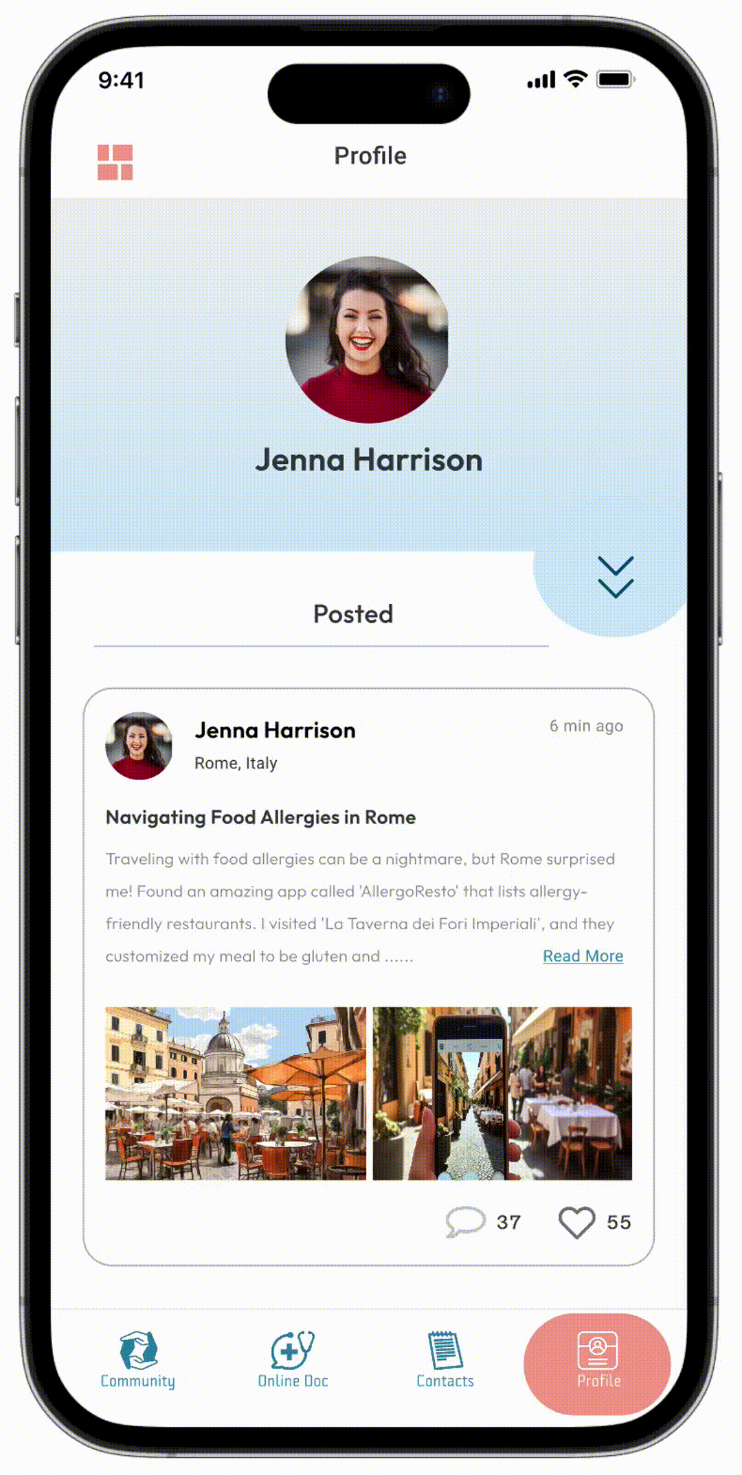
Community
The community hub is designed for digital nomads to get the reviews of local medical services from others' experience. There are three main pages, daily, assist and urgent: daily experiences shared in daily, requests for assistance would be shown in assist. As for the Urgent page, users could upload urgent requests to get response as soon as possible. All the text would be translated to the user's chosen language automatically.


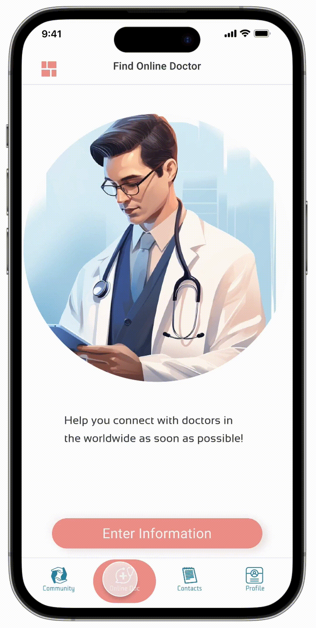
Online Doctor
The online doctor function is designed for digital nomads to get professional first aid instructions who in urgent situations but have difficulty accessing local medical services at that moment.
They can set their language at this page and then it will match the online doctors all over the world who speak the same language as the users and specialized in the condition that users met.
They can have a video call with matched doctor and get clear instructions immediately.
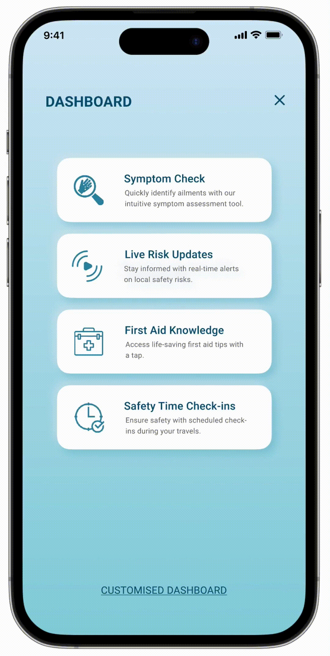
Symptom Check
As for the symptom checker feature, its purpose is to enable users to gain a general understanding of the causes behind their current symptoms, along with immediate treatment methods. This aims to alleviate the anxiety that comes from uncertainty about the severity of their symptoms.
Users can interactively select the affected areas on a human body diagram, offering a clearer and more intuitive way to describe their symptoms. Possible causes will be listed in order of likelihood, providing users with an anticipated understanding of their current health status.
Emergent Contact Lists & Update Location
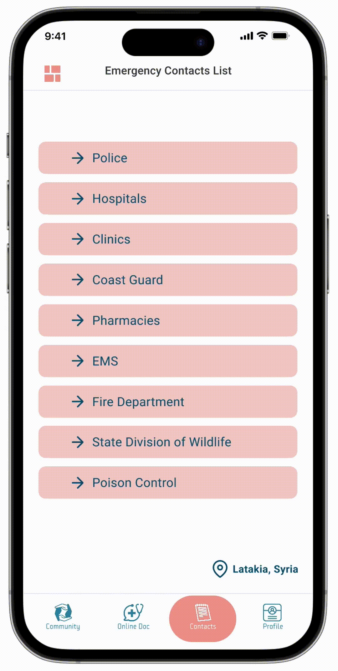
The Emergency Contact List is a centralized hub of information of all the emergency numbers that every traveller should easily accessible on them.
This list includes numbers such as the police, the hospital, and the EMS, etc. These numbers are automatically updated based on the location users feed into the app. This location can either be users’ live location, or another location that you enter manually to the app.
We decided to have these two options for choosing a location to give flexibility to the user in case they want to check the emergency numbers for a location they are not in at the moment.
Life Risk Updates
Live Risk Updates is go-to news page about any risk safety events around users. This page is linked to the location user have in the app, and based on that location, they get the news of anything that might risk their safety and they should be aware of.
Profile Page
Users can also set their health and medical information in their profile page, which can be shared with online doctors or local medical services in multiple languages.
TEST
Usability Test
After we finished our High Fidelity Prototype, we did usability test. We asked our users to do the same tasks from the greyscale mockups user testing. We also asked for feedback from users during technigala.
Feedback:
Although users can check the reviews about local medical services in the community hub pages, they prefer a dedicated section that would show a list of local medical services, such as clinics and pharmacy, where they can leave reviews and rate their services from several aspects, so that they can choose a reliable medical service based one their needs.
Reflect
Takeaway&Next Step
Takeaways
Nom' Mate is created to address the problem that digital nomads have difficulty to get access to local medical services when they are in unfamiliar places, especially in urgent situations. During our presentations in Technigala, we received positive feedback from users. We enjoyed this process a lot.
This final project is also a challenging task, we tackled it in three weeks while balancing it with our other final assignments. We changed the topics several times at the beginning, which reduced the real time we worked on this final topic to only two weeks as we kept were exploring the different target audiences we want to work with. Despite all of that, it was enjoyable to find users' pain points and convert their needs to specific functions.
We understood how users interact with the app, particularly the symptom checker feature, and how it offers valuable insights into the user’s behavior and preferences. Exploring the application of UX design in healthcare has always been an interest of ours, and we’re happy to have had the opportunity to take our first steps in this class!
Next Step